This Blog is completely dedicated to its
viewers...
use of the content available on this blog for commercial purpose is forbidden until I(SkanD GupT) give permission...
Oh man! this is taking the concept of wallpaper to the extreme. So many choices only confuse me. I feel all are great!!
But what I have learned from using a lot of wallpapers is that those illustrations that look great in a browser or in an image viewer don't necessarily look great as a wallpaper (and vice versa!).
Also, I like the wallpapers that are simple and are not too distracting.
I am tempted to like the first one. Black color is one of my favorites and I also like the "coming out" effect that you have used. Now if only u hadn't used this AirBrush tool (I guess) to create this grainy effect with white color.
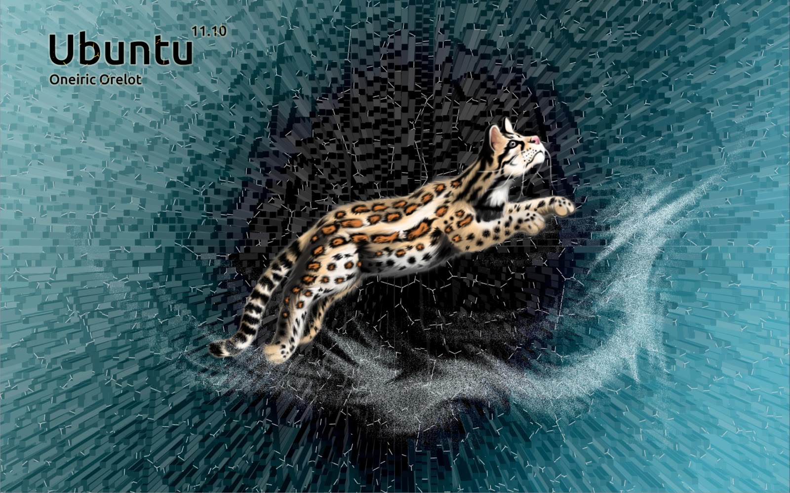
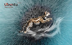
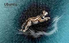
2nd one reminds me of some of the default wallpapers I saw in the Ubuntu OS 2-3 years ago (because of its color), I also like the little effect that you have made, but I guess the "Pitchkari" tool that you have used in a lot of wallpapers isn't my cup of tea).
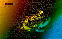
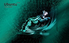
3rd one ko dekh kar to sach me chakkar aa rahe hain :D
The 4th and 5th ones look great in short size (especially the 4th ones preview is fantastic, little bubbly type) but they don't do justice when actually used on the desktop.
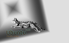
6th one builds up on the 2nd one, looks good.
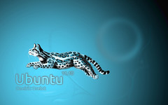
7th, 8th and 10th are similar to each other (and similar to 5th). Blue is my favorite color out of them.
I like the 4th last owning since it gives the desktop a slick look (may be because of color) but I like the 2nd last ones glowing "Ubuntu" name especially the last "u".
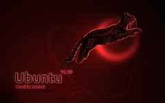
The last one, as I have pointed before, is bit too much "burned".
@RavS Hey you know When I created that black one I was just amazed with myself and you know it was like"Oh Man what I have got"
so I can uderstand Why you got tempted
and that "pichkari tool" hahahahahahahahaha man WoW ,what a name! thank you but I call it sand effect actually I was trying to create something but now I see It came out nothing but as a pichkari,wow once again . Thank you
well that's fantastic mate! But I guess it may be a thing of illustrating for friends.
Because this happens with me too. When I make a blog, sometimes it comes in my mind for whom I am writing this blog for, who are going to read it, so some of the thoughts might get skewed because of that (I am not sure).


Oh man! this is taking the concept of wallpaper to the extreme. So many choices only confuse me. I feel all are great!!
ReplyDeleteBut what I have learned from using a lot of wallpapers is that those illustrations that look great in a browser or in an image viewer don't necessarily look great as a wallpaper (and vice versa!).
Also, I like the wallpapers that are simple and are not too distracting.
Wallpapers that give some peace/serenity.
Thats right, all are awesome as illustration, but those without too much complication will look great as wallpaper.
ReplyDeletewell buddy check now .....
ReplyDeletein full resolution...!!!!
looks great mate, I like the 2nd one and the 3rd last the most. Great work!
ReplyDeletealrite thanks..
ReplyDeleteand
which you don't like and why..???
I dint like the third one because of the complicated background...mujhe chakkar aa gaye...
ReplyDelete@PK
ReplyDeletehey Feel good to hear that...
well
rigth response...
I think "KOi chakkar ni khana chahta...apne wallpaper ko dekh ke.."
so ur reason accepted...
keep going...I like it..!!!
try to find a reason to reject each .....one..
If you can...
then tell me..
Is there any one which you can't reject...
let me know...this too...
I am tempted to like the first one. Black color is one of my favorites and I also like the "coming out" effect that you have used. Now if only u hadn't used this AirBrush tool (I guess) to create this grainy effect with white color.
ReplyDelete2nd one reminds me of some of the default wallpapers I saw in the Ubuntu OS 2-3 years ago (because of its color), I also like the little effect that you have made, but I guess the "Pitchkari" tool that you have used in a lot of wallpapers isn't my cup of tea).
3rd one ko dekh kar to sach me chakkar aa rahe hain :D
The 4th and 5th ones look great in short size (especially the 4th ones preview is fantastic, little bubbly type) but they don't do justice when actually used on the desktop.
ReplyDelete6th one builds up on the 2nd one, looks good.
7th, 8th and 10th are similar to each other (and similar to 5th). Blue is my favorite color out of them.
9th one is similar to 4th and the color combo (so many bright colors) look good as an image but a strict NO NO for a wallpaper.
ReplyDelete11th one has a bit too much of white in between (it reminds me of another KDE wallpaper I have seen before).
Last 4 are again quite similar in design.
ReplyDeleteI like the 4th last owning since it gives the desktop a slick look (may be because of color) but I like the 2nd last ones glowing "Ubuntu" name especially the last "u".
The last one, as I have pointed before, is bit too much "burned".
@RavS
ReplyDeleteHey you know When I created that black one I was just amazed with myself
and you know
it was like"Oh Man what I have got"
so I can uderstand Why you got tempted
and
that "pichkari tool"
hahahahahahahahaha
man WoW ,what a name!
thank you
but I call it sand effect
actually I was trying to create something
but now I see
It came out nothing but as a pichkari,wow once again .
Thank you
@ RAvs:
ReplyDeleteyou know which reminds you of ubuntu wall of 2 or 3 yrs ago
when I was making it
I knew you would like it
bcz I could remember your company when I was making it!
so thank you bcz it was pleasing :-)
Hey you know
ReplyDeleteMy favourites are
from the bottom
5th
and
9th
now
from the top
1st
and
2nd
"I could remember your company when I was making it!"
ReplyDeleteHehe, ye line to PK ko bhi boli thi!
So, you think about us while making illustrations and fill different colors!
And our friendship had a light brownish, sandy color? ;)
hey you guys mean a lot to me!
ReplyDeletethats why .
no actually you guys were never out of my mind
so its not like I think about you when I am creating illustration or anything
Its like you people reside in me as memories which inspires me ,pushes me n all
see thats how it is.
hey our friendship is Classy
see
the class that color gave to the wallpaper man
well that's fantastic mate! But I guess it may be a thing of illustrating for friends.
ReplyDeleteBecause this happens with me too. When I make a blog, sometimes it comes in my mind for whom I am writing this blog for, who are going to read it, so some of the thoughts might get skewed because of that (I am not sure).
I hope it's not the case with you.